A Beginner’s Guide to Creating Professional Event Materials

Imagine walking into a conference or festival and being instantly drawn to a beautifully designed poster or a sleek name badge that feels thoughtfully crafted. You might not even realize it, but those visuals set the tone for the entire experience. They make you think, “This event is legit.” That’s the power of professional event materials—they don’t just share information; they shape perception, build excitement, and create a sense of trust.
If you’re new to event planning, you might think creating these materials requires a team of designers and a big budget. But the truth is, with today’s tools and a few smart design strategies, anyone can craft event materials that look polished, cohesive, and professional. Whether you’re organizing a networking mixer, a charity gala, or a local community fair, this guide will walk you through everything you need to know to create materials that make your event shine.
Why Event Materials Matter More Than You Think
Event materials are often the first—and sometimes the last—thing attendees see. They introduce your brand, communicate essential details, and keep people engaged long after the event ends.
Think about it: the invitation sets the first impression. The signage directs guests effortlessly. The programs and flyers reinforce your event’s identity. And afterward, branded takeaways like brochures or thank-you cards keep the experience alive.
In short, event materials are the glue that holds everything together. They don’t just make your event look good—they make it feel organized, credible, and memorable.
Start With the Big Picture: Branding and Tone
Before you open any design tool, pause and think about your event’s personality. Is it formal or casual? High-energy or relaxed? Educational or entertaining? Your materials should visually reflect that identity.
For example:
- A corporate seminar might use clean lines, neutral colors, and modern typography.
- A charity fun run could embrace bright colors and playful graphics.
- A luxury gala might lean into elegant fonts and minimalist layouts.
Your tone should stay consistent across every item—from flyers to name tags—so attendees feel a cohesive experience from start to finish. Consistency builds trust, and trust builds attendance.
Choose the Right Materials for Your Event
Professional-looking event materials don’t stop at invitations or posters. Depending on your event type, you’ll want to prepare a mix of both print and digital assets. Here’s a breakdown:
1. Pre-Event Materials:
- Save-the-date announcements and invitations (digital or printed)
- Event landing page or registration form
- Social media graphics to build buzz
2. On-Site Materials:
- Welcome signs, directional signage, and banners
- Programs, flyers, and brochures
- Name badges and lanyards
- Presentation slides or digital screens
3. Post-Event Materials:
- Thank-you notes
- Feedback forms
- Recap emails or highlight reels
Each element reinforces your brand and enhances the attendee experience. And the best part? With the right approach, you can design them all without breaking a sweat—or your budget.
See also: Benefits of Pursuing a Master’s Degree in Singapore
Design That Delivers: Simple Rules for Beginners
Even if you’ve never designed anything before, you can still produce materials that look professional by following a few key principles:
1. Keep It Clean and Focused.
Less is more. Avoid cluttering your design with too much text or too many graphics. White space is your friend—it draws the eye to what matters most.
2. Use Consistent Fonts and Colors.
Pick two or three fonts (a headline, a subhead, and a body font) and stick with them. Do the same with your color palette. This creates a visual rhythm that feels intentional and polished.
3. Prioritize Readability.
Remember, event materials are functional. Make sure your key information—date, time, venue, and call-to-action—is clear and easy to read from a distance.
4. Use High-Quality Images.
Blurry or pixelated visuals can instantly make your design look unprofessional. Choose crisp, high-resolution images that align with your event’s mood and message.
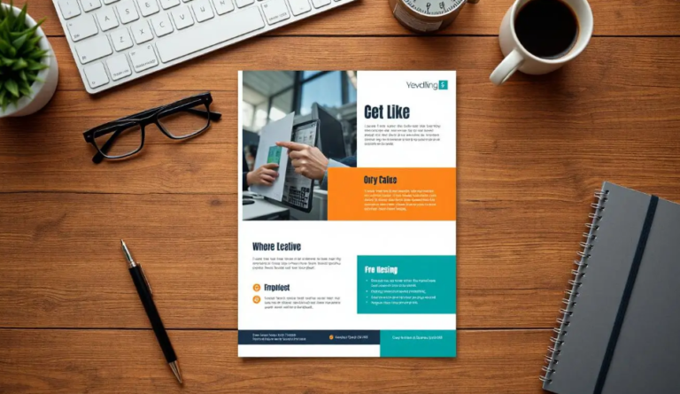
Templates: Your Secret Design Weapon
Here’s the good news—you don’t need to start from scratch. Design templates have become game-changers for event planners, especially beginners. They offer ready-made layouts that you can customize with your own text, colors, and images, saving you hours of work.
Platforms like Adobe Express offer a wide range of printable flyer templates, which you can adapt for everything from event invitations to on-site signage. These templates help you maintain a professional look without needing advanced design skills. Simply plug in your content, adjust the visuals to match your branding, and you’re good to go.
Templates also ensure consistency. You can easily use the same style across all materials, so your invitations, banners, and programs feel like they belong to the same event family—a key factor in creating a cohesive brand experience.
Add Technology for a Modern Touch
Today’s event materials don’t have to stay static. You can easily integrate digital elements to enhance engagement and make the experience interactive.
1. QR Codes: Include QR codes on flyers, posters, or table tents that link directly to your event schedule, registration form, or speaker bios. It’s a small touch that makes life easier for attendees.
2. Social Media Handles and Hashtags: Encourage guests to share their experience by prominently featuring your event’s hashtag. This not only builds online buzz but also extends your event’s reach beyond the venue.
3. Digital Displays: Use digital screens at your event to share live updates, sponsor messages, or attendee shoutouts. It adds energy and professionalism to your setup.
These small tech integrations modernize your materials and show that your event is well thought out and attendee-friendly.
Case in Point: How Design Shapes Perception
Consider two fundraising events. The first has plain black-and-white flyers printed on standard paper, while the second uses glossy, colorful handouts with consistent branding, easy-to-read fonts, and thoughtful details like a QR code for online donations.
Both events might be equally important, but guess which one people are more likely to remember—and trust? The difference often comes down to presentation. Design communicates care, attention to detail, and credibility before you even say a word.
Common Mistakes to Avoid
Even the best ideas can fall flat with small but costly missteps. Here are a few to watch for:
- Too much text: Keep it short and impactful.
- Ignoring alignment: Misaligned text or logos can make your materials look rushed.
- Using random images: Stick with visuals that support your event’s theme.
- Skipping proofreading: Typos can undermine credibility fast—always double-check!
Polish matters, especially when your materials represent your event and brand to the world.
Putting It All Together
Creating professional event materials doesn’t have to be overwhelming. Start with a clear sense of your event’s identity, use templates to streamline design, and ensure every piece feels cohesive and intentional. Don’t be afraid to experiment—but always keep your audience’s experience front and center.
At the end of the day, your materials aren’t just about aesthetics. They’re about communication. They help guests navigate your event with ease, make your sponsors look good, and most importantly, leave attendees with a lasting impression of your professionalism and creativity.